Technique Tuesday – Waterfall Card!!!

Posted on

Happy Tuesday!!! That means I have a fabulous technique to share with you today and this one is super fun!!! It is a great way to show off Designer Series Paper or have a greeting slowly reveal itself. Check this out!!!

Waterfall Card, www.laurasstamppad.com

 Look at all of these color and amazing look!!! The magic happens when you pull the ribbon tab at the bottom – each square moves up and flips over to reveal the one below it. Then a message pops out as well – “Just as sweet as can be”! This style of card is called a Waterfall Card!!! Let’s get started!

You will need the following pieces:

  • Three 2″ x 2″ Squares – I used Watermelon Wonder Peekaboo Peach, and Daffodil Delight.
  • Three 1-3/4″ x 1-3/4″ Designer Series Paper (or Whisper White to stamp on) – I used the Fruit Stand Paper.
  • 1-3/4″ x 8-1/2″ piece of Crumb Cake, scored at 1-3/4″, 2-3/4″ and 3-3/4″ for the waterfall base
  • 1″ x 4-1/4″ piece of Dapper Denim to go across the card and hold your waterfall in place
  • 8-1/2″ x 5-1/2″ Dapper Denim card base
  • 4″ x 5-1/4″ piece of Designer Series Paper for background. I used the Fruit Stand Paper.

Okay now we are ready to get started assembling. If you prefer to stamp and image or greeting on each of the squares, you will want to do that first. If you are using Designer Series Paper like I did above, let’s get started! Adhere each of the 1-3/4″ Squares to the 2″ Solid Cardstock Squares. Now you will take the strip of Crumb Cake and fold on each of the score lines. You will see there are 3 rectangles created with the score lines. You will add adhesive to each of the rectangles. Then starting at the end (last rectangle), place one of the squares centered side to side and covering the entire rectangle. Continue to do this with the other 2 squares as well. Your waterfall will have each of the squares on the front with a long piece going down the back. Underneath the squares will be where you will want to stamp a greeting if you wish! I stamped a greeting from the Sweet Stack Stamp Set. You will also want to add your ribbon for the pull tab. You can punch a hole with the 1/8″ Handheld Punch or you can always staple a piece of ribbon folded in half! I used the Dapper Denim Ruched Ribbon. Now your waterfall is complete. Fold your card base in half and adhere the Fruit Stand Designer Series Paper to the front (4″ x 5-1/4″). Now to assemble your waterfall to your card. You will adhere the end (end with the Fruit Stand Square on it to the center of the Dapper Denim (1″ x 4-1/4″) and allow the other end of the Crumb Cake (end with the ribbon) to go behind the Dapper Denim. Now you will add adhesive to the either end of the Dapper Denim cardstock and adhere to your card. Make sure to use a strong adhesive like Fast Fuse or Tear & Tape since people will be tugging at the waterfall and you don’t want it to pop off. Also, make sure you only add the adhesive to the outer edges and not in the middle or your waterfall won’t……fall! I added some Daffodil Delight Enamel Shapes to either side for a little texture!

Collage of Waterfall Card, www.LaurasStampPad.com Don’t worry if you are completely lost on how I created this card because I did a Video Tutorial so you can see the magic and how it all comes together. You can check that out here or click below! Don’t forget to give it a thumbs up if you liked and be sure to subscribe if you are new!!!

Happy Stampin’

~Laura


What A Gem – July Paper Pumpkin Kit!!!

Posted on

July 2016 Paper Pumpkin Kit, www.LaurasStampPad.com

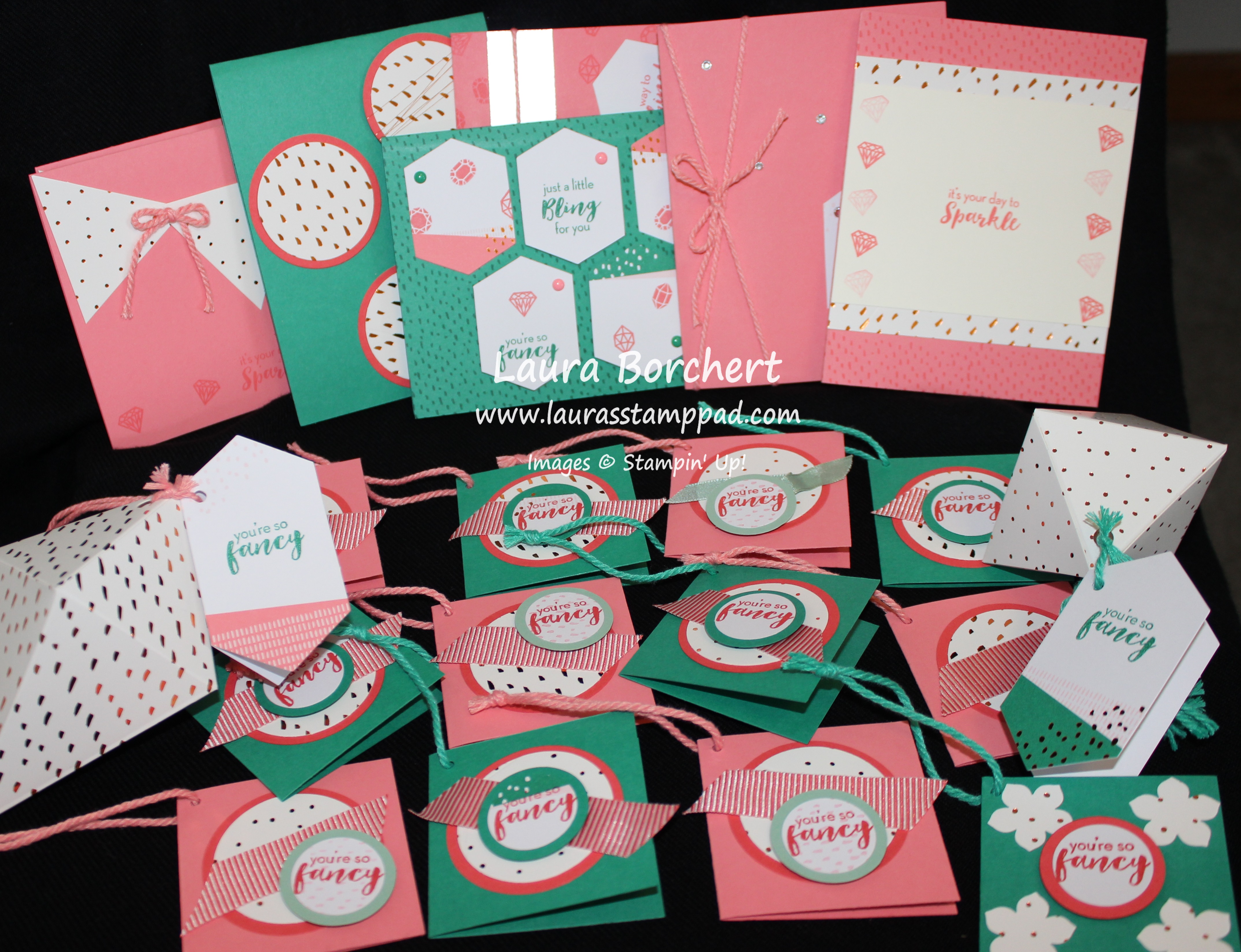
Look at all of these beautiful creations – 2 treat boxes with tags and tassels, 12 mini gift tags, and 7 regular sized cards!!!! When the July Paper Pumpkin Kit arrived, I opened it up (check that out here) and loved the colors, loved the bling, loved the stamp set…..but it was treat boxes. I don’t really care for treat boxes because I just don’t use them before they get tossed around and smashed or forgotten. So I made 2 of the boxes (1 of each style) and then let the creativity flow…….

Diamond Boxes, www.LaurasStampPad.com

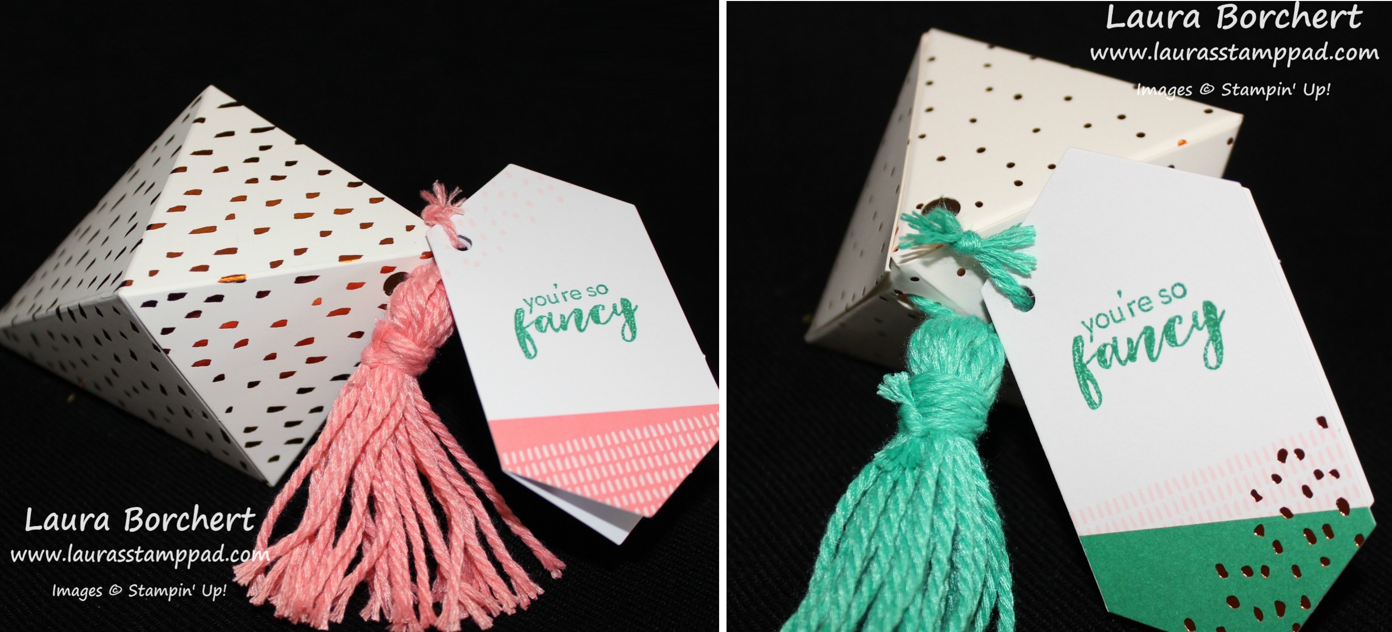
Here are the boxes which are a super fun diamond shape and the tassels were actually VERY easy to make. That was another hesitation when I opened the box because I have attempted tassels before. I used the word attempted because it never worked. These were super easy, quick and turned out amazing!!!

Mini Gift Tags, www.LaurasStampPad.com

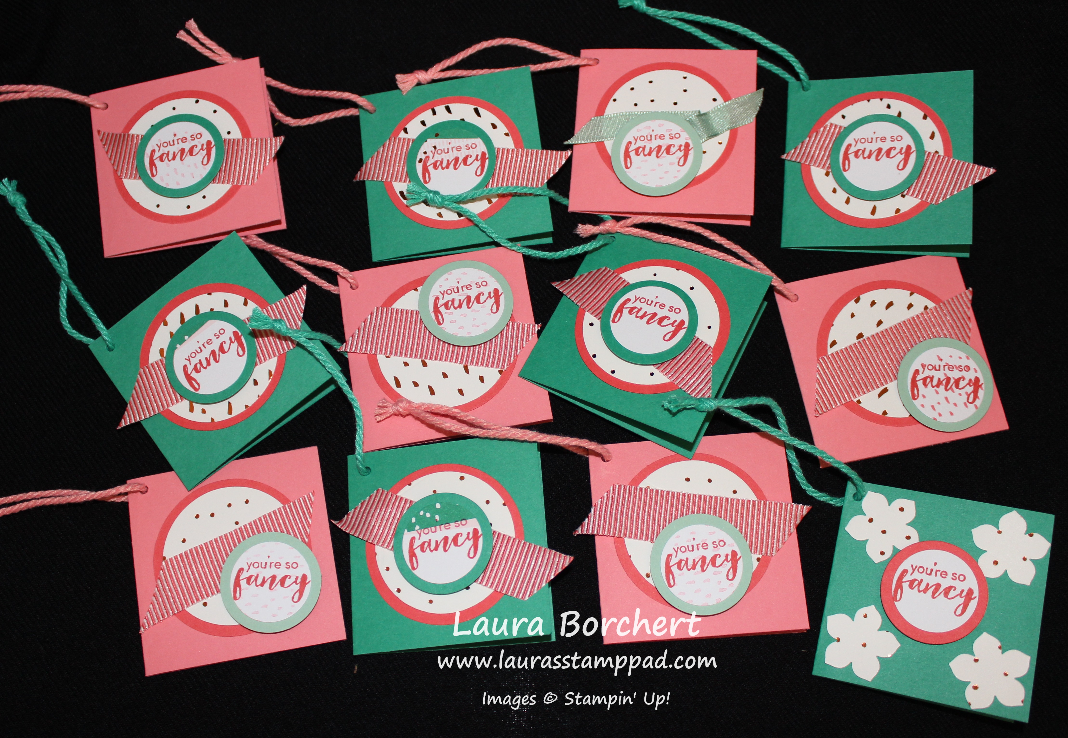
These were super simple and fun to make. I got the inspiration from a Demonstrator gathering event I attended and they did a similar gift tag on the Thank You gifts! Thank you to Meg Loven for the idea!!! I will be giving gifts at my Birthday Celebration Stamp Class later this month and these will be perfect!!!! I used a 2-1/2″ x 5″ piece of cardstock for the card base. I punched out circles from the treat boxes and used the gift tags for the greetings and punched them out as well!!!

Way To Shine, www.LaurasStampPad.com

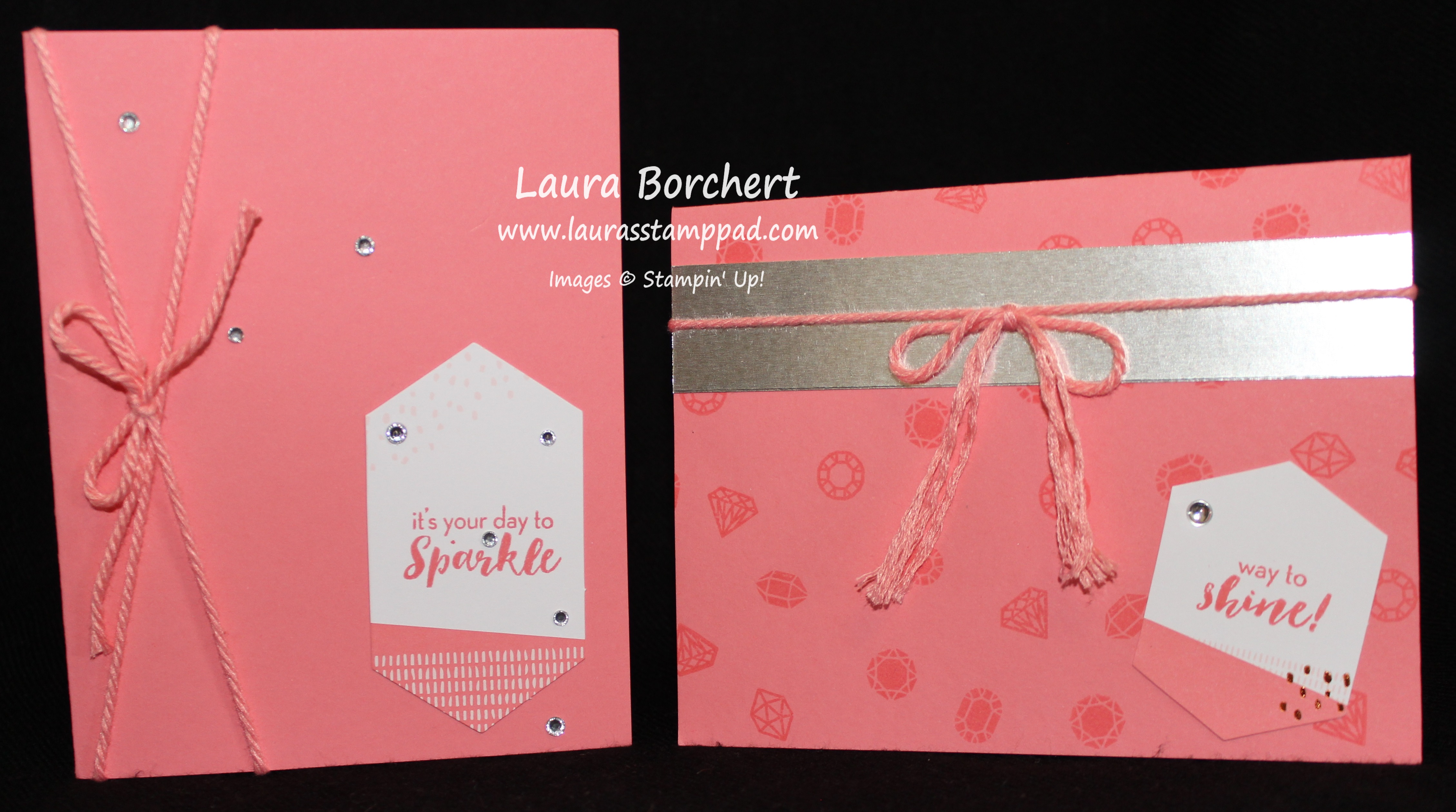
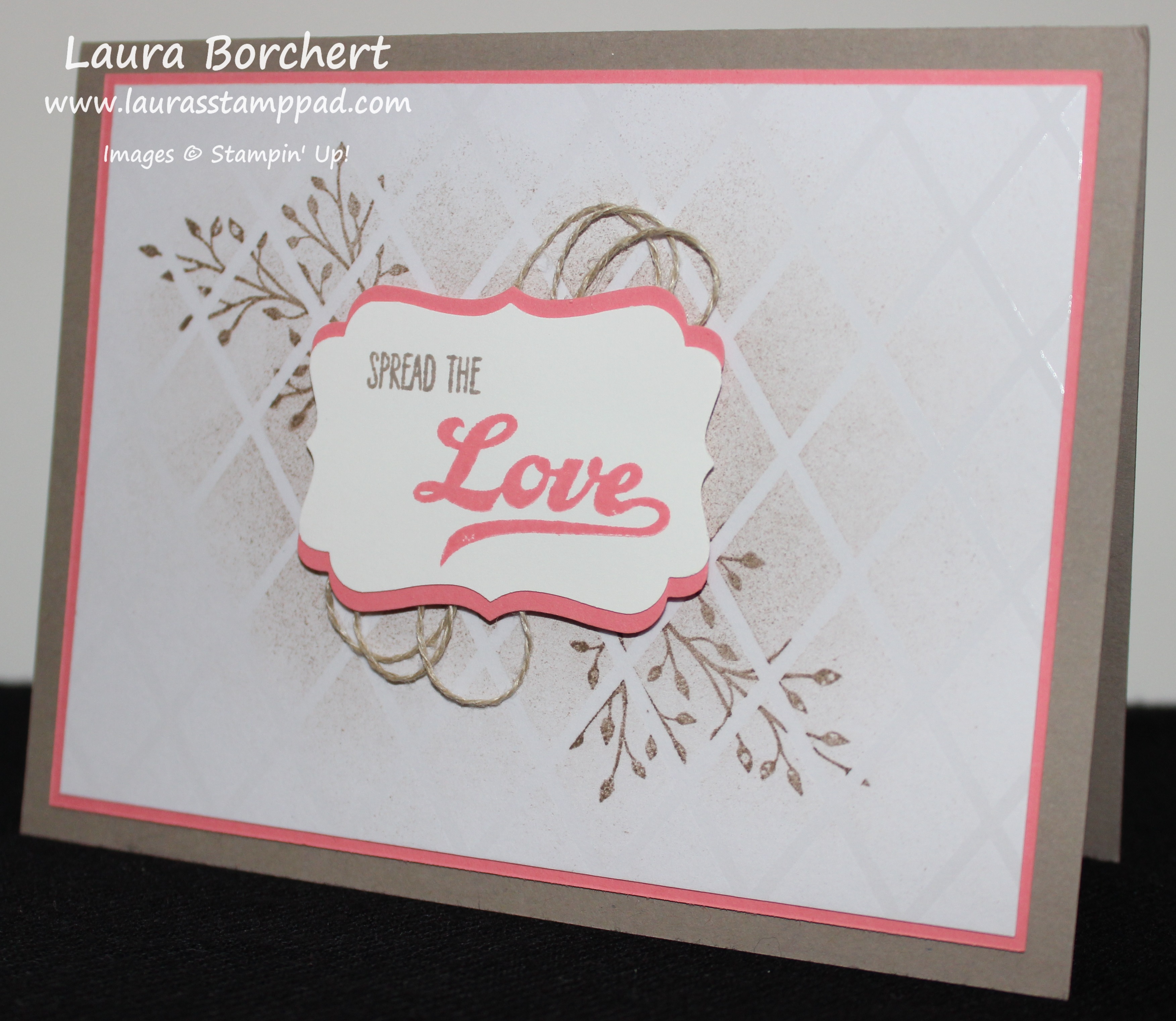
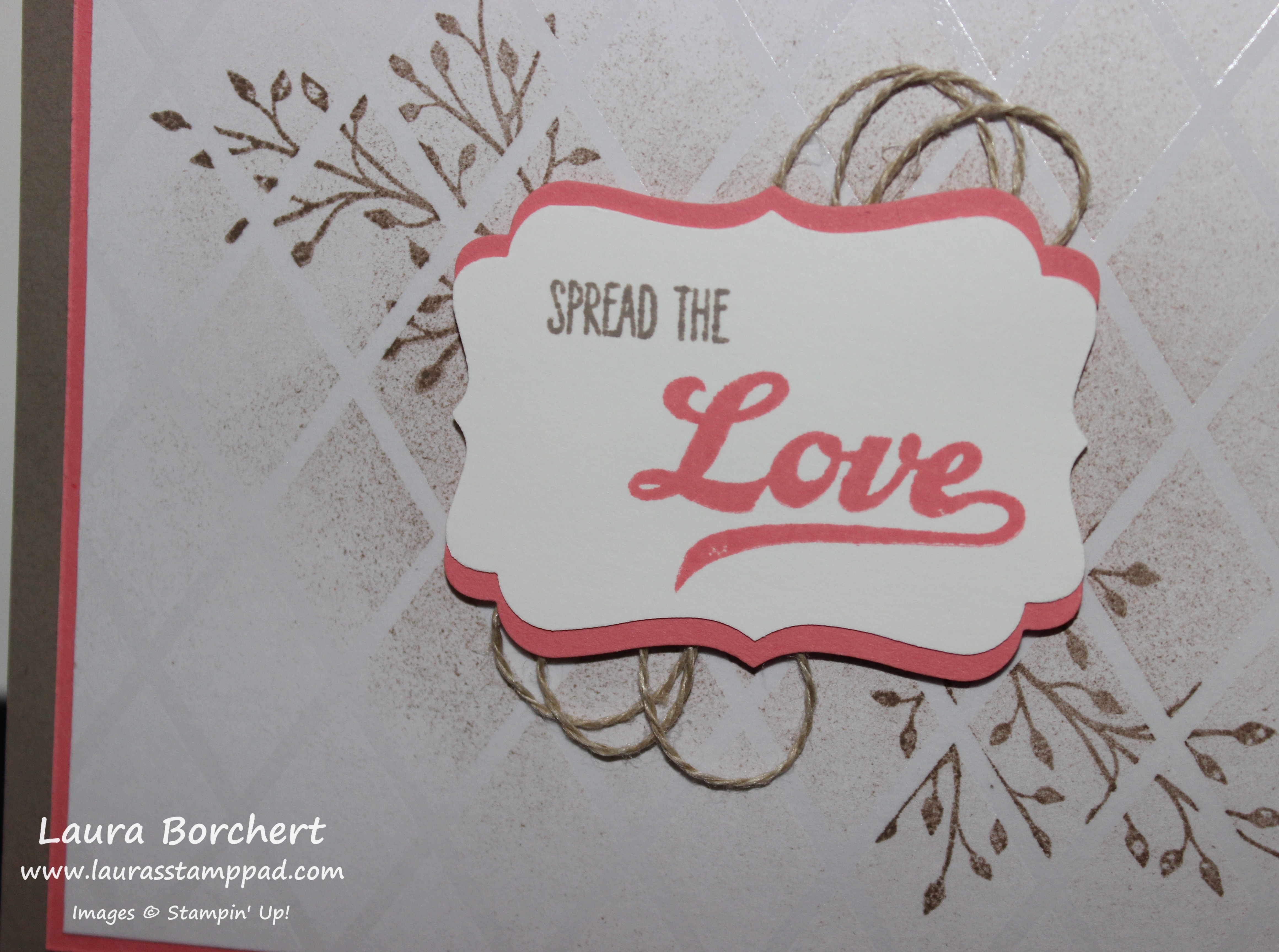
Then I made some full sized greeting cards with the stamps, tags, and twine. I added a little Rhinestone over the hole on the tag and it looks fabulous!!!

Just a Little Bling, www.LaurasStampPad.com

Here I used the background stamp to create texture on the card and then I took the gift tags and cut them in half and added gems and greetings! Punching out the boxes and cutting the tags in half gives you so much more product to work with and create just about anything!!! Of course, the little Enamel Shapes add the perfect bling and cover up those holes.

Copper Banners, www.LaurasStampPad.com

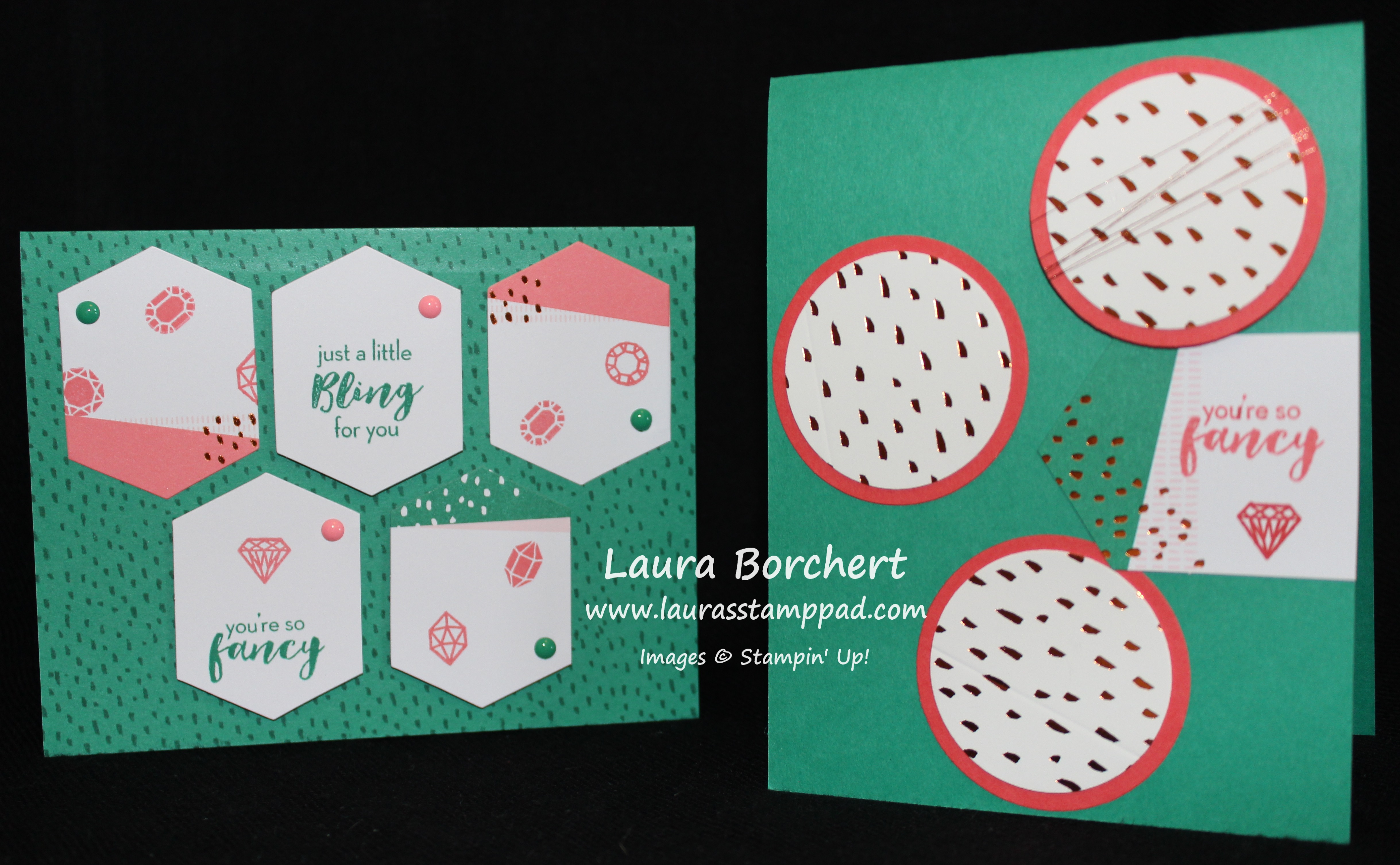
These are my favorite of all. Those copper polka dot banners are fabulous and the little bows are just precious! It scream baby girl to me!!! I love it!!! The best part is the triangles were already set, I just cut on the score lines of the boxes. The “little miss perfect” is from the Greatest Greetings Stamp Set.

It's Your Day to Sparkle, www.LaurasStampPad.com

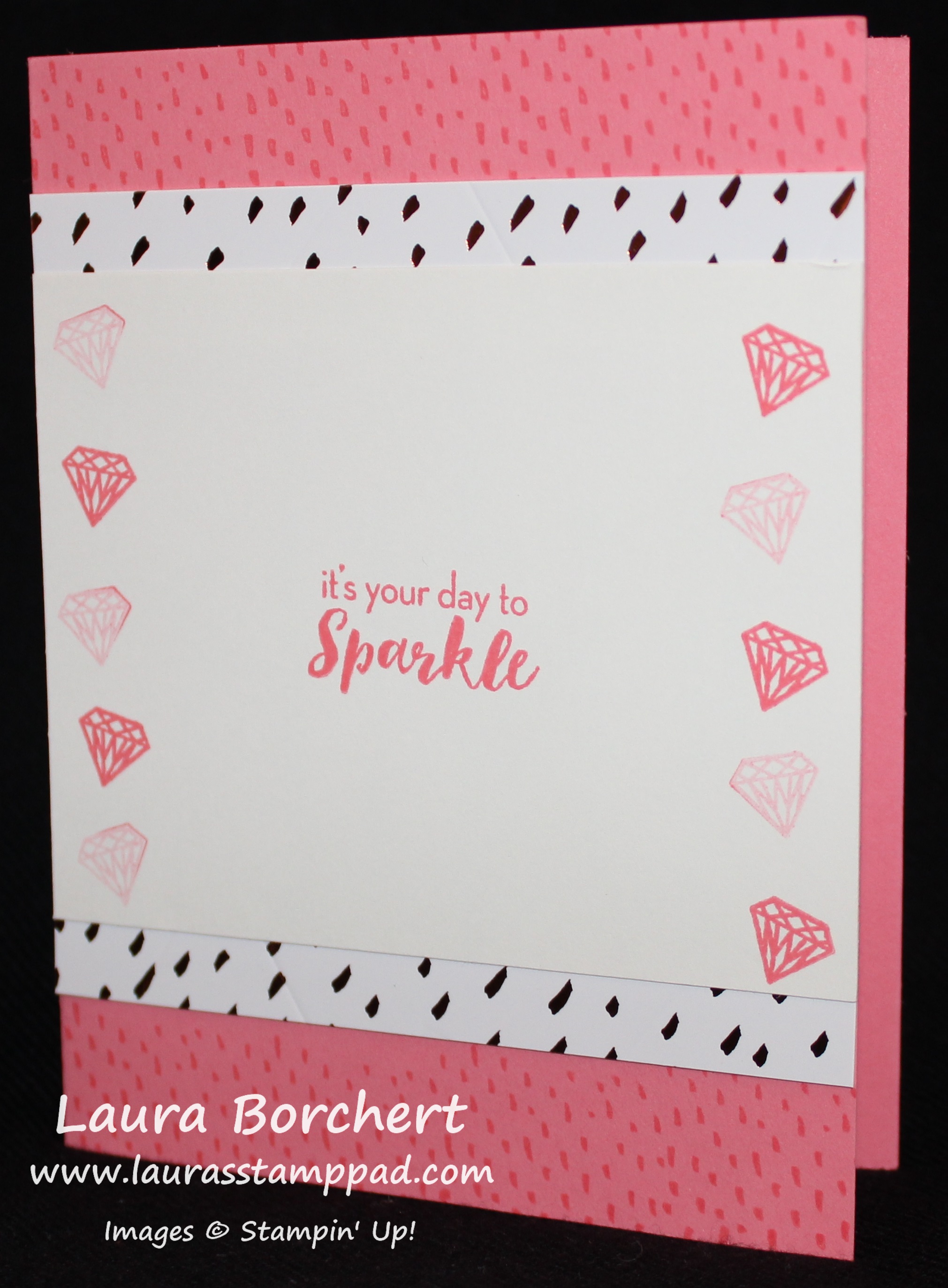
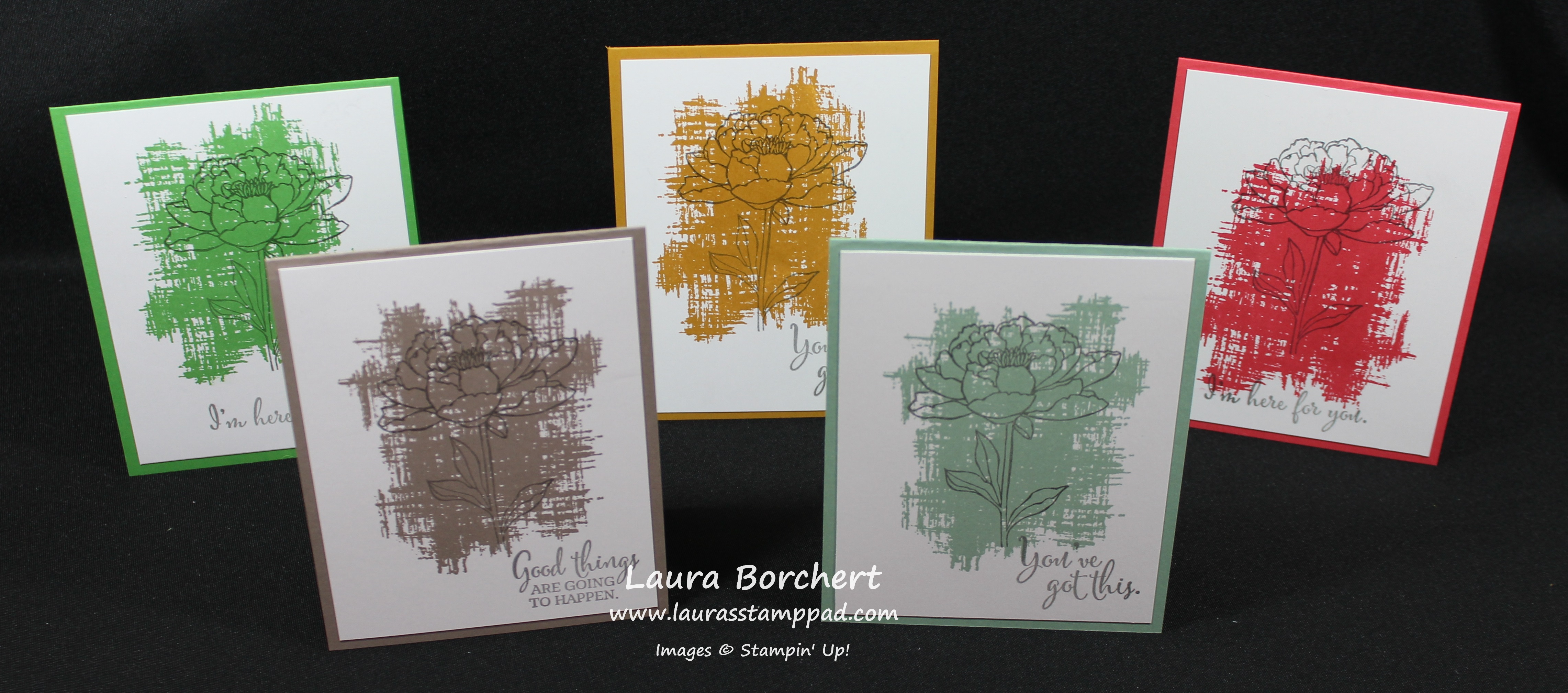
For this card, I used the background stamp for the top and bottom and then cut stripes of the box for a little bling! I stamped on Very Vanilla cardstock for the greeting and gems! Love it!!!

I hope these projects have inspired you to get creative with your Paper Pumpkin Kits even if you don’t care for the initial project! 🙂 You can always see TONS of samples on Pinterest as well. Search July 2016 Paper Pumpkin, What a Gem, or Paper Pumpkin Alternatives. Lots of great ideas. Don’t forget that you can purchase refill kits of past kits! If you would like to get the August Paper Pumpkin Kit, be sure to sign up by August 10th. Click here to get started!

If you would like to see past kits, check out the samples here!

Happy Stampin’

~Laura


Technique Tuesday – Stamp Resist!!!

Posted on

Happy Tuesday!!! I hope you are all having an amazing week! I have a fabulous technique to share with you today!!! I am in love with this card so hard – the colors, the sweet greeting, and the amazing look!!! I hope you love it too!

Spread The Love, www.LaurasStampPad.com

Isn’t it amazing??? I love how the branches look like they are behind a fence or something with that emboss resist!! Let’s get started on how simple this card is!

SUPPLIES NEEDED: Irresistibly Yours Designer Series Paper, Sponge Brayer, Greetings & Embellishment of Choice

I started with a piece of the Irresistibly Yours Designer Series Paper measuring 5″ x 3-3/4″ and Tip Top Taupe Ink. Using a Sponge Brayer, you will start in the middle and roll out half way, turn, start in the middle and roll out half way. This is how I got that rustic/dirty center but kept the edges fairly clean. I went all the way around the card from the middle and then at the end I lightly went over the entire piece of cardstock just for a light look. Then I used the branch from the Jar of Love Stamp Set and inked it up in Tip Top Taupe and stamped it diagonal to the upper left and lower right. You will want to make sure that the entire tail end of the branch doesn’t stamp down because it might show on the other side of your greeting. If you go with a larger greeting, you will be fine. Be sure to wipe off any excess ink with a paper towel as it sometimes pools on top of the embossed portion. Then I layered it onto a piece of Flirty Flamingo (5-1/8″ x 3-7/8″) and then onto a Tip Top Taupe card base. Now you can add your greeting of choice. I went with the Jar of Love Stamp Set since it was already out. I stamped the “Love” in Flirty Flamingo and the “Spread The” in Tip Top Taupe onto Whisper White scraps. I punched it out with the Decorative Label Punch and added a layer of Flirty Flamingo behind it. Click here to see how easy it is to do that. I added a few loops of Linen Thread behind the greeting and secured it with Stampin’ Dimensionals. I love it for that rustic, sweet, messy look!!!

Emboss Resist, www.LaurasStampPad.com

If you would like to see this in action, check out the Video Tutorial below or click here! Don’t forget to give it a thumbs up if you liked it and be sure to subscribe if you are new!!!

If you would like to see more samples using the Irresistibly Yours Designer Series Paper, stay tuned. I have been playing with this paper a lot and have some great samples to share!!!

Happy Stampin’

~Laura

Click here to start shopping and earning Bonus Bucks through the end of July!

Bonus Days


Incredible In-Colors!!!

Posted on

Circle, Circle, Dot, Dot, www.LaurasStampPad.com

New Stampin’ Up In- Colors are always fun but also takes some time to get used to. When I first saw the colors, I thought they looked nice but wasn’t in love. Then I started to play with them and really started to fall in love. You all know I love Pink so Flirty Flamingo is super fun. I have been really surprised that Peekaboo Peach has been a favorite of mine! I didn’t really think I would love that color as much as I do but I think it is because we don’t have anything close to that color. The other 2 colors, Emerald Envy and Dapper Denim have been lots of fun together. They are the perfect man card color combination!!!

For this card, I started with a Whisper White card base and stamped the dots from the Timeless Textures Stamp Set all over the background in all 3 colors – Flirty Flamingo, Sweet Sugarplum, and Peekaboo Peach. One thing you want to keep in mind when stamping a background is to fall off the cardstock. You want the pattern to look like it continues on rather than just being in the middle of your card. Then I punched out circles in each of the colors with the 2″ Circle Punch, 1-3/4″ Circle Punch and 1-1/2″ Circle Punch. I added all of the circles to the card front, overlapping a bit. Then for the greeting, I used the Thoughtful Banners Stamp Set! I stamped the border in Sweet Sugarplum, the little arrow in Flirty Flamingo and the greeting in Peekaboo Peach. Thank goodness for photopolymer stamps so you can see exactly where you are stamping! I punched out the greeting with the Classic Label Punch and added it to the card with Stampin’ Dimensionals. Remember you can use the outside border of the Dimensionals and just trim off the amount that you need. Those thin little border pieces are perfect for a skinny little greeting like this. To finish off the card, I added a few pop of bling with Rhinestones! Love it!!!

This card could be used for lots of different occasions and with different color combinations. Let me know in the comments below what 3 colors you would use! I would love to hear your favorite combos so I can try them out as well!

Happy Stampin’

~Laura

Bonus Days

Bonus Days are still going on!!! For every $50 you spend, you will earn $5 to use from August 2nd – 31st!!! Click here to start shopping!!!


2015-2017 In-Colors!!!!

Posted on

2015-2017 In-Colors, www.LaurasStampPad.com

How beautiful are these NEW 2015-2017 In-Colors????? I love them….okay wait to be honest, I LOVE two of them, two I like and one is growing on me. Can you guess which colors go into which category??

Watermelon Wonder – LOVE LOVE LOVE! It is such a bright and fun pinkie/red color! Watermelon! I love it!

Cucumber Crush – LOVE LOVE LOVE! This color is so vibrant. It is a bright green but not neon and not really lime colored. It is just fabulous! A fun green to play with….oh Night of Navy and Cucumber Crush. That would be fabulous!!

Tip Top Taupe – Believe it or not this is my #3! This is the perfect color between gray and tan. You all know I’m not a fan of browns but Crumb Cake is fabulous because it is more tan. Well this has a little more gray in it so it’s darker. I really like it for a neutral color!!!

Mint Macaron – I like this color but not so much right now since we are in the middle of Spring/Summer. I want bright colors. This color will be perfect for Winter, Baby Stuff, or those soft cards that you want to make. Just to clarify, it is pronounced Maca-RON….not maca-roon. There is a difference but don’t worry I’m sure I will catch myself saying it both ways! 🙂

Macaron.roon

Delightful Dijon – this color is ehh for me. You all know how I love bright colors and this one is far from it. It is a dark dirty yellow color. I might like it more in the Fall or maybe I never will fall in love!

These colors will be out for 2 years and there are lots of new products in these colors – Designer Series Paper, Lace Trim, Blossom Accents and so much more!!! The cards that I created above use the New You’ve Got This Stamp Set. I stamped the big background image in each of the In-Colors and used Basic Gray for the greeting and flower! Love it! Quick and simple for sure! All the stamping was done on a piece of Whisper White measuring 4″ x 5-1/4″ and layered onto the coordinating In-Color card base! You have no clue how bad I wanted to mix and match the bases with the stamped image. I love mixing it up but I also love the simplicity of one color!

You've Got This, www.LaurasStampPad.com

Let me know your favorite In-Color in the comments below! Also, let me know your favorite color combination – it can include the In-Colors or not!

Happy Stampin’

~Laura